Fun with temperature chartsIt was time to write a program! I named the result tchart.c. The tchart program uses some modules the source code of which I do not want to post on the Internet so you can't compile a working executable yourself. You're welcome to try these precompiled executables: Linux: tchart Windows: tchart.exe Documentation: tchartdoc.txt And here's the output! (All charts are 1500x1125.)
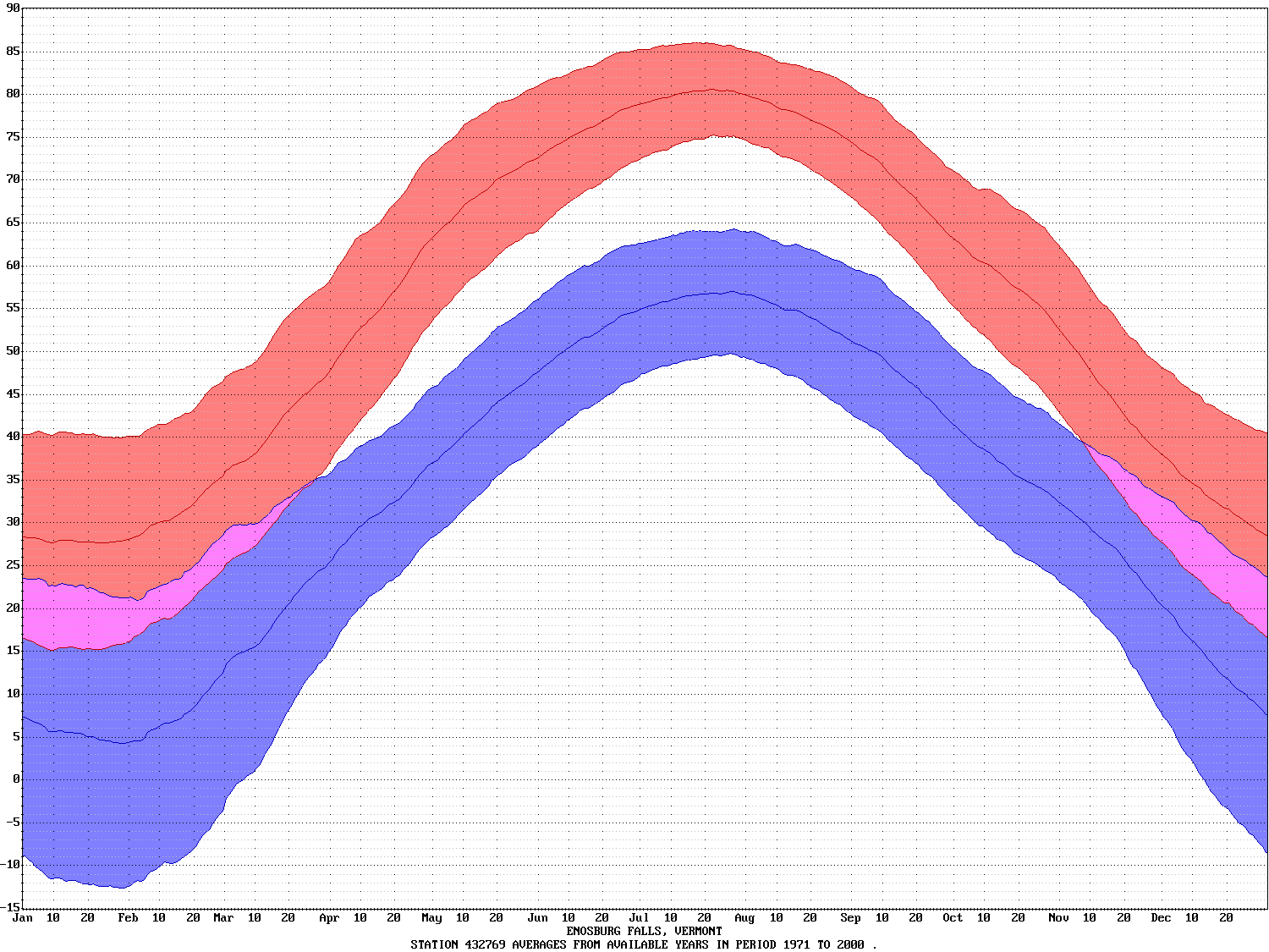
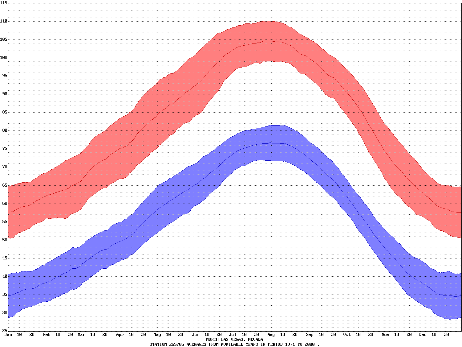
The red line is the average high temperature for each day. The blue line is the average low temperature for each day. The shaded areas are plus and minus one standard deviation. There is about a 2/3 chance that the high and low temperatures for a given day are inside the shaded areas. What's notable about Enosburg's chart is how variable temperatures are in the winter. This is not news to Northern Vermont residents. The Enosburg chart made me feel cold so I did one for North Las Vegas.
I showed the charts to my friend Jim King of Katy, Texas who revealed that he's been collecting temperature data for 10 years. He sent me his data files and I wrote a program to summarize them and put the data into the WRCC web page format as katy.html. Then I created the chart:
It's clear that 10 years of (slightly spotty) data isn't as good as 30 years of (hopefully less spotty) data. Surely the data can be smoothed somehow. My first approach was to add some averaging code to the charting program. Here's the Katy chart with a moving average of +/- 3 samples (-average 3):
Not good enough in my opinion so I added some median filtering code. Here's the Katy chart with a moving median filter of +/- 3 samples (-median 3):
Worse! It was time to bring out the big guns. I dusted off my matrix library and added code to calculate least-square best fit polynomial curves. Here's the Katy chart with a 12 term polynomial (-lsq 12):
That's more like it! Here are the original and polynomial charts superimposed:
One problem with polynomial curve fitting of data of this type is that the ends aren't perfect. The values and slopes for January 1 and December 31 should be nearly equal. Even though during the matrix setup I replicated the data 30 days on each side a close examination shows that the ends don't match. Cyclical data like this is best treated with the Fast Fourier Transform. I linked in the excellent Kiss FFT library written by Mike Borgerding. and added code to low frequency filter the data by zeroing out high frequency components of the Fourier transform. Here's the Katy chart with just the five low frequency terms (-fft 5):
With low frequency filtering using the Fast Fourier Transform the ends must be correct. Here are the polynomial and FFT charts superimposed so you can see the slight differences:
Copyright © 2009, Richard Heurtley. All rights reserved. |